Android: Rounded Corners with a Bevel/Drop Shadow
How to give Android layouts rounded corners with a bevel/drop shadow using one XML layer-list drawable instead of many 9-patch images.

Sometimes in Android you want to add a little depth and personality to your android layouts. A basic layout is rectangle with square corners and is quite ugly. I’m going to show you how to create this:
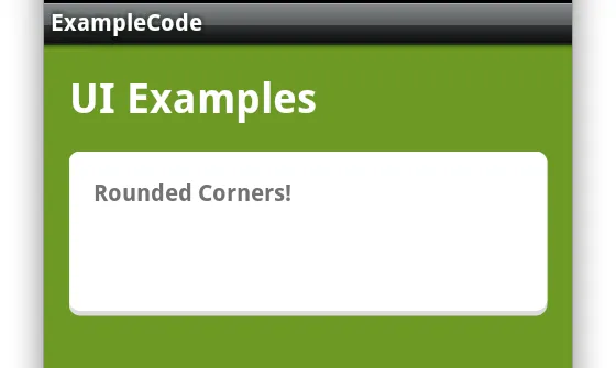
Notice the bottom part of the screen shot, we have a small bevel/shadow to help create depth in the view. This can be completed with one of two ways.
- A 9 patch image
- XML Drawable
I’m going to show you how to do this with a XML Drawable.
Why not use a 9 patch image? Simple … you’d need many 9 patch images for MDPI, HDPI, and the various other resolutions and folders. Therefore, if you need to update this you’ll need to edit/create many different images in order to update the design. With the XML drawable approach you will only need one file (the one you’re about to create) and the Android system will draw the items on the screen for each resolution. Its much easier to maintain and utilize in the app.
XML Drawable
To create an XML Drawable, create a file with the name of rounded_corners_white.xml in the /res/drawable folder.
In the file fill it in with this code:
layer-list
A layer list is just that, a list of layers that will compose the drawable that Android will draw on the screen. A layer-list contains various layers that you define. They are evaluated from top to bottom. meaning the layer on the bottom will be “on top” (kind of backwards, I know).
The first item is an item that defines the background shadow. What I have defined here is a background grey color with a corner radius the same as the bottom layer. This basically creates the same exact shape as the top, but with a different color. At this point we have a rounded rectangle with rounded corners.
Now for the bottom. The bottom item contains a shape that is a rectangle with rounded corners. Pretty simple. The only difference is this code: android:bottom=”3px”. This code instructs the android platform to offset this layer by 3px on the bottom. Therefore, the grey background will now show from the bottom layer giving the effect that there is a shadow/depth to the layout.
Applying the XML Drawable
To apply the rounded corner to a LinearLayout (or Relative, Frame, etc) you will need to set the XML Drawable to the background property of the layout as shown below.
You’ve now set the background to “@drawable/rounded_corners_white” and when you run the app you will now have rounded corners with a drop shadow/bevel/depth to it.
I’ve added other items to this view (the text views) and background colors so you can see it on your app and so it looks somewhat good.
Enjoy.